Albertsons Finance & Merchandising · Shipped 2025 - 2026
From Excel to forecast planning in real time
38%
More forecast adjustments tracked, with a recorded reason
75%
Adoption rate among merchants and financial analysts

- UX Strategy
- Data & Dashboard Design
- Design Systems
- AI-Assisted Prototyping
- Design Workshop
Overview
Allocatr is an AI-assisted forecasting platform that replaced the Excel workflows Albertsons’ merchant and finance teams used to plan category budgets. I led the UX strategy with the global engineering team and US-based business and product partners.
Initial research
Category Managers and Finance teams at Albertsons set and adjust the forecasts that drive category budgets. They used to run everything on printed reports and emailed spreadsheets, manually fixing discrepancies every single week. After talking to users, I found this workflow failed to meet their needs.
Without corporate finance direction, their intuition-led projections and edits triggered version chaos across teams.
Design workshop
I led a cross-functional workshop to map the planning cycle and discovered key stakeholder pain points and opportunities.
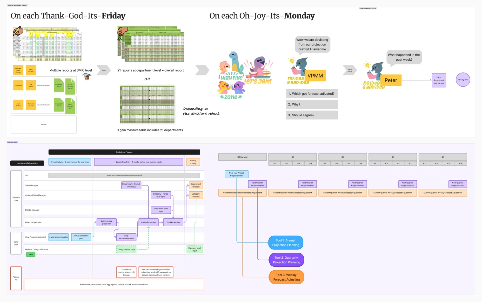
How might we let Category Managers and Finance teams use reporting and business intelligence directly for category growth, instead of rebuilding it by hand in Excel?
Opportunities
Based on the workshop, I guided my team to develop the core MVP features.
- One editable interface for every role I split roles into a view-only leadership dashboard and an editable, audited sheet for operators.
- A modern data dashboard with Excel-like conventions To overcome Excel resistance, I used the grid UI from Albertsons’ UDS Design System, combining familiarity with modern design.
- AI-assisted features I explored AI automation to tackle repetitive tasks and give the team a fresh analysis tool.
The solution
Early design exploration
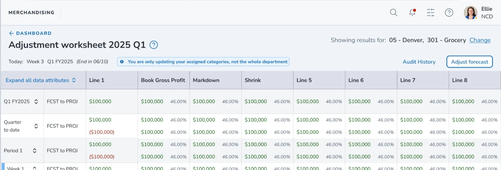
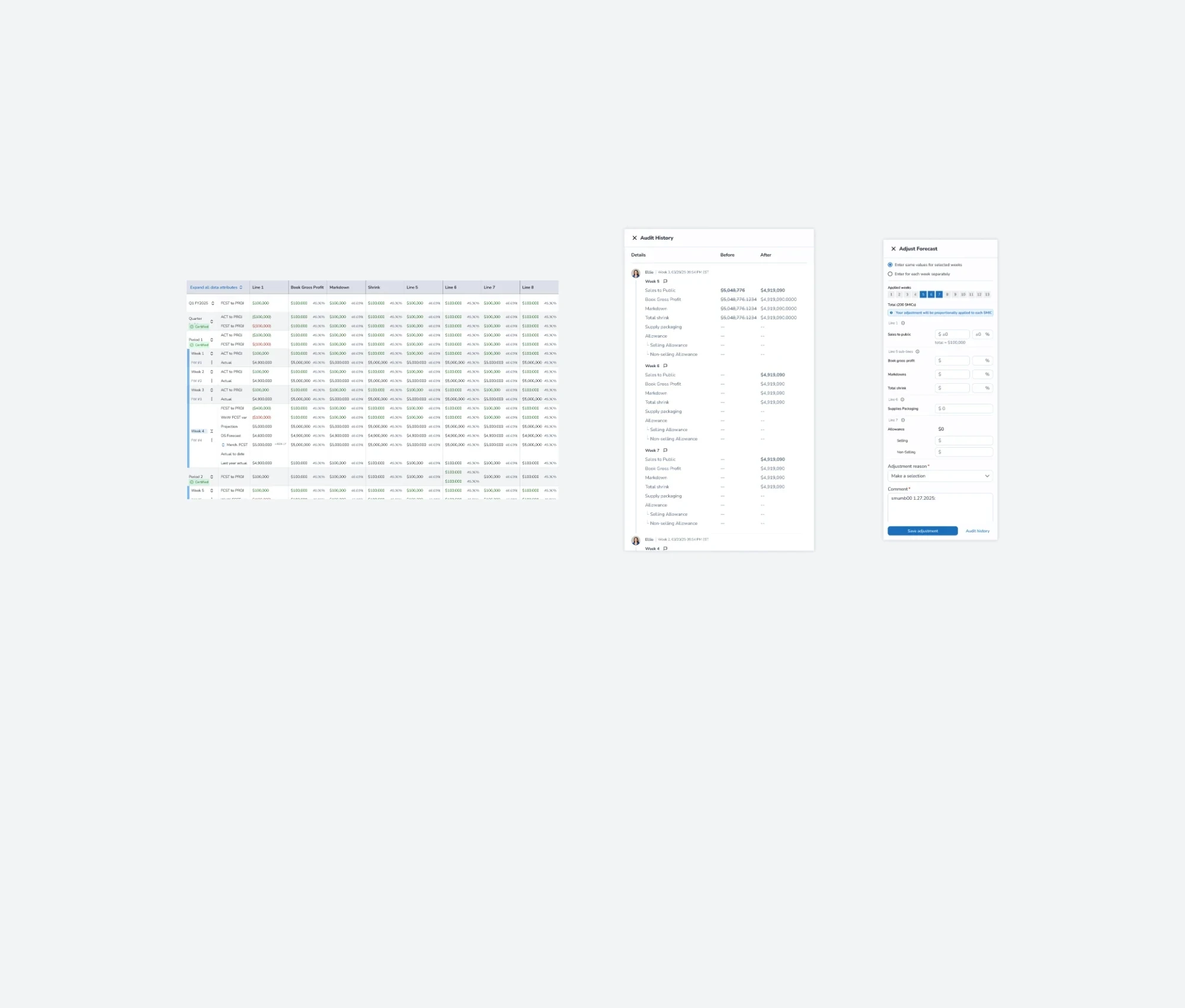
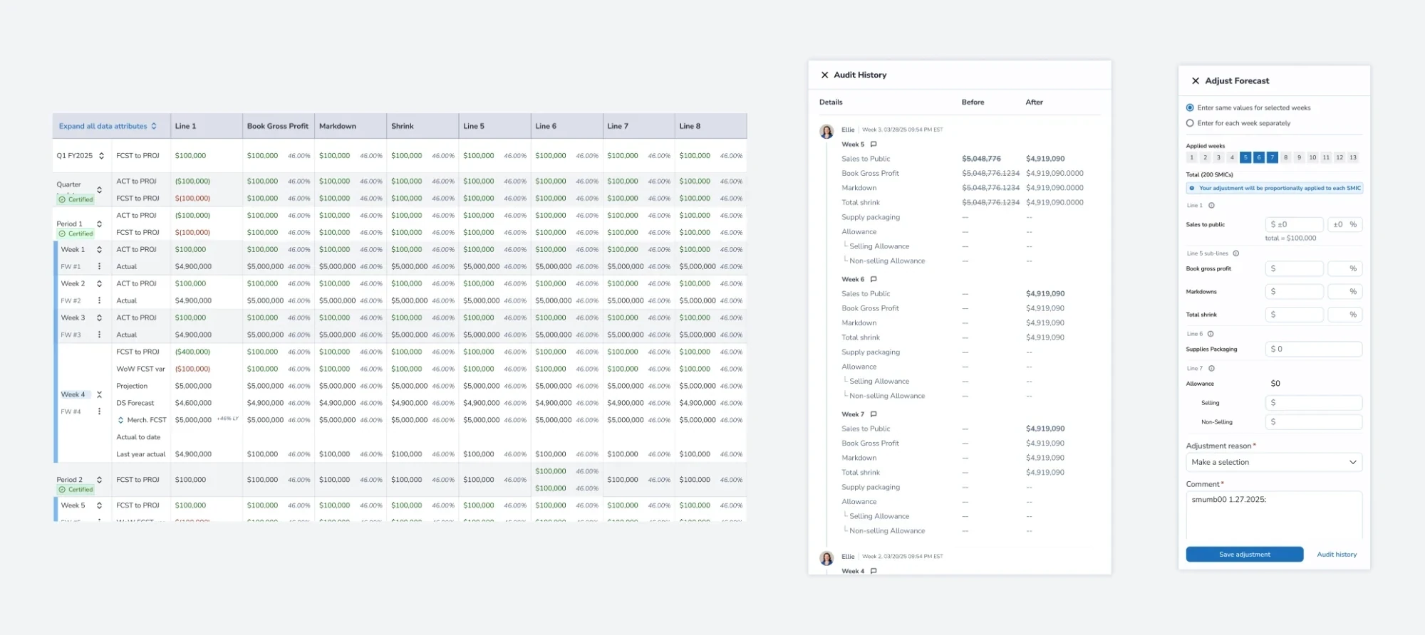
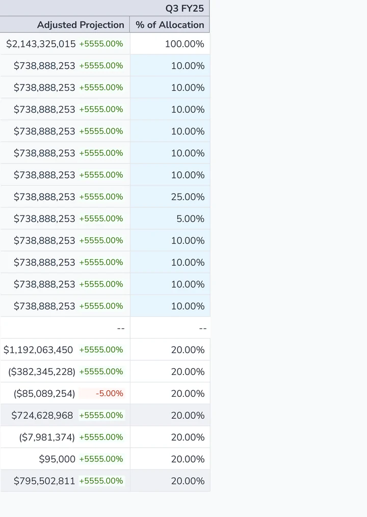
I started by creating the foundational tables for the adjustment worksheet, adding audit trails and approval flows as core functions for Category Managers and the finance team.
PMs advocated for a data visualization concept
I prototyped PM-requested heatmaps and bar charts, but ultimately pushed back against them for two key reasons.
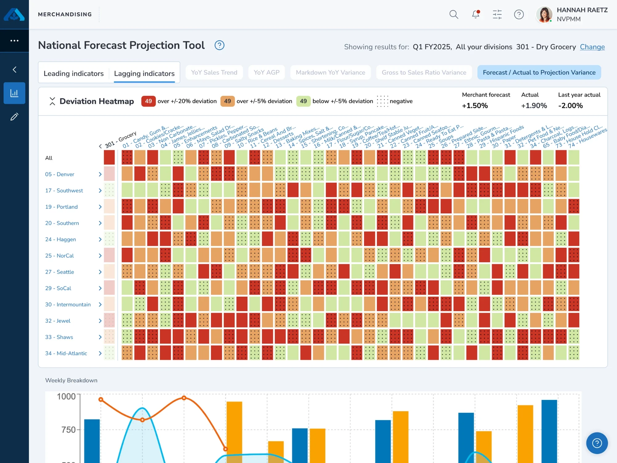
The data visualization masked the data and distracted users from their intended task (forecast adjustment).
Workshops showed that users’ mental models favored Excel layouts over new designs, so adoption was low.
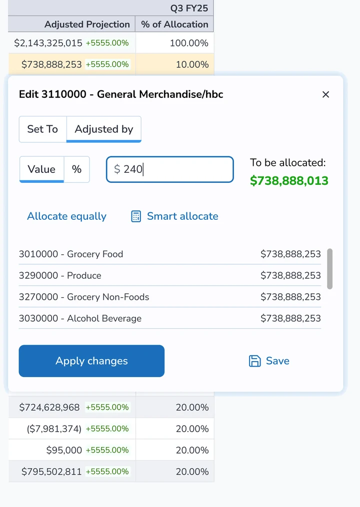
I moved ahead by defining core features: an adjustment drawer for line-item edits and multi-line adjustments with full audit trails.
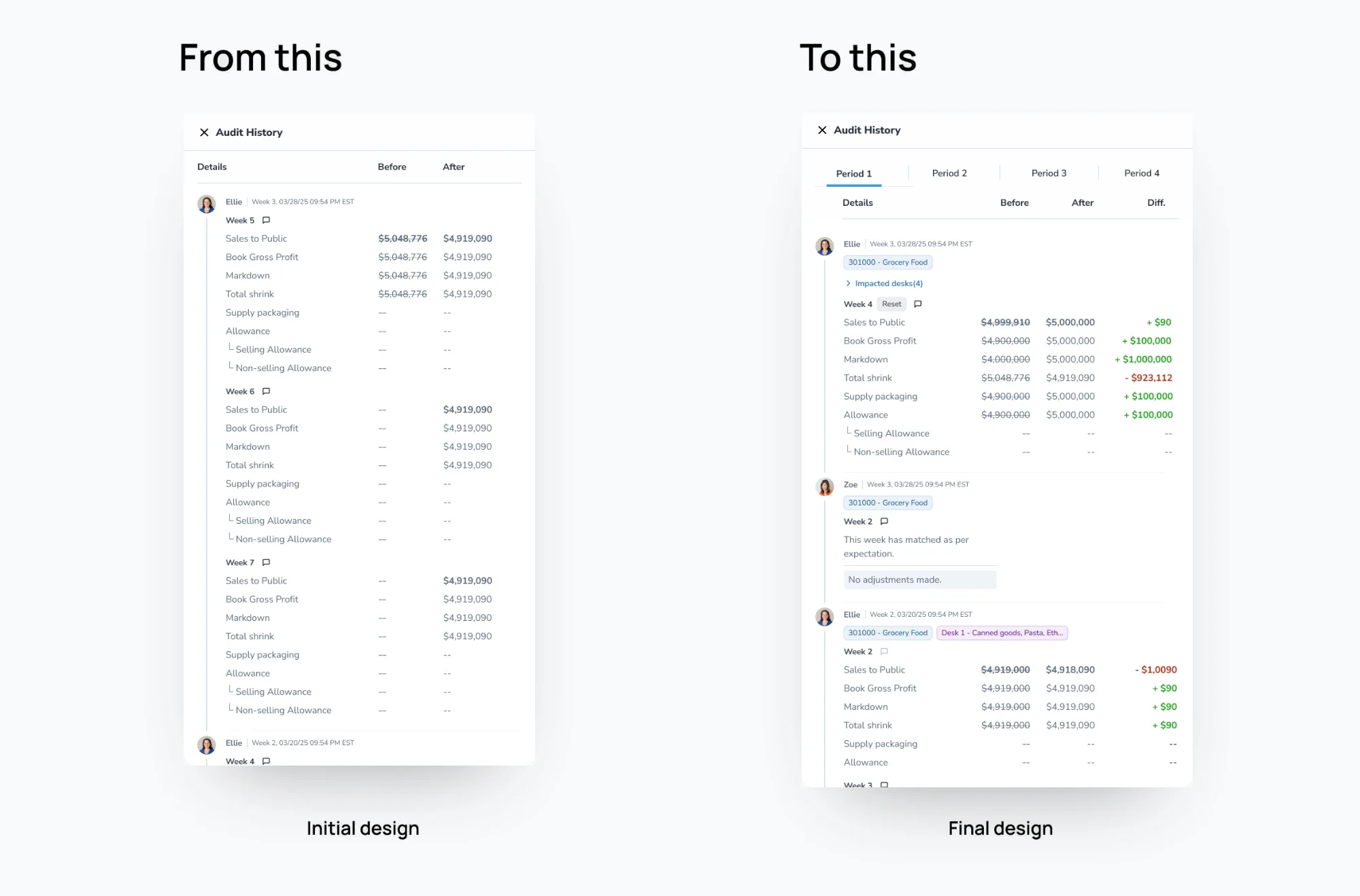
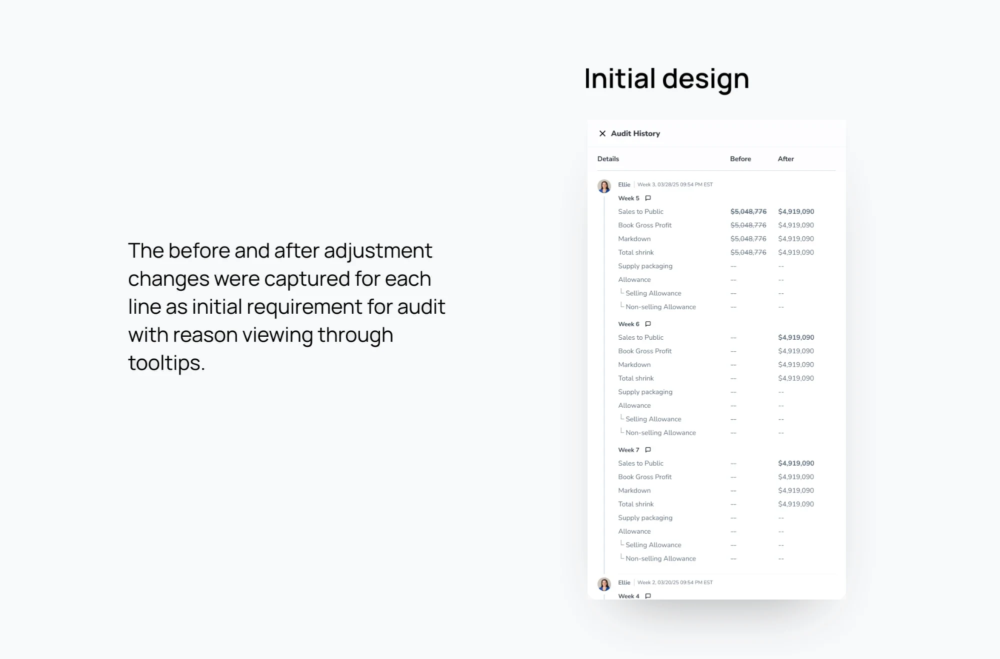
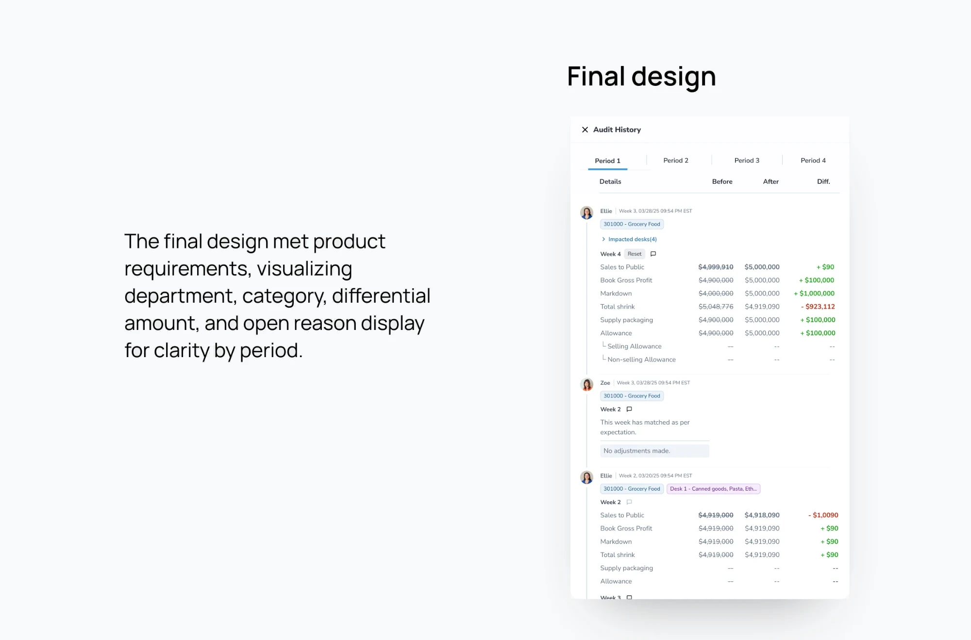
Audit trail
Recording every divisional change gave departments clear visibility into affected versus untouched desks through side drawers on the adjustment table.
Dashboard
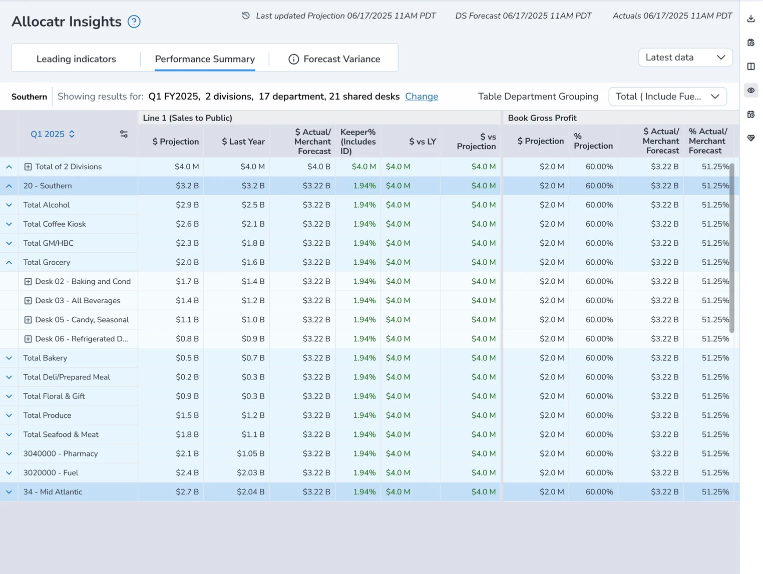
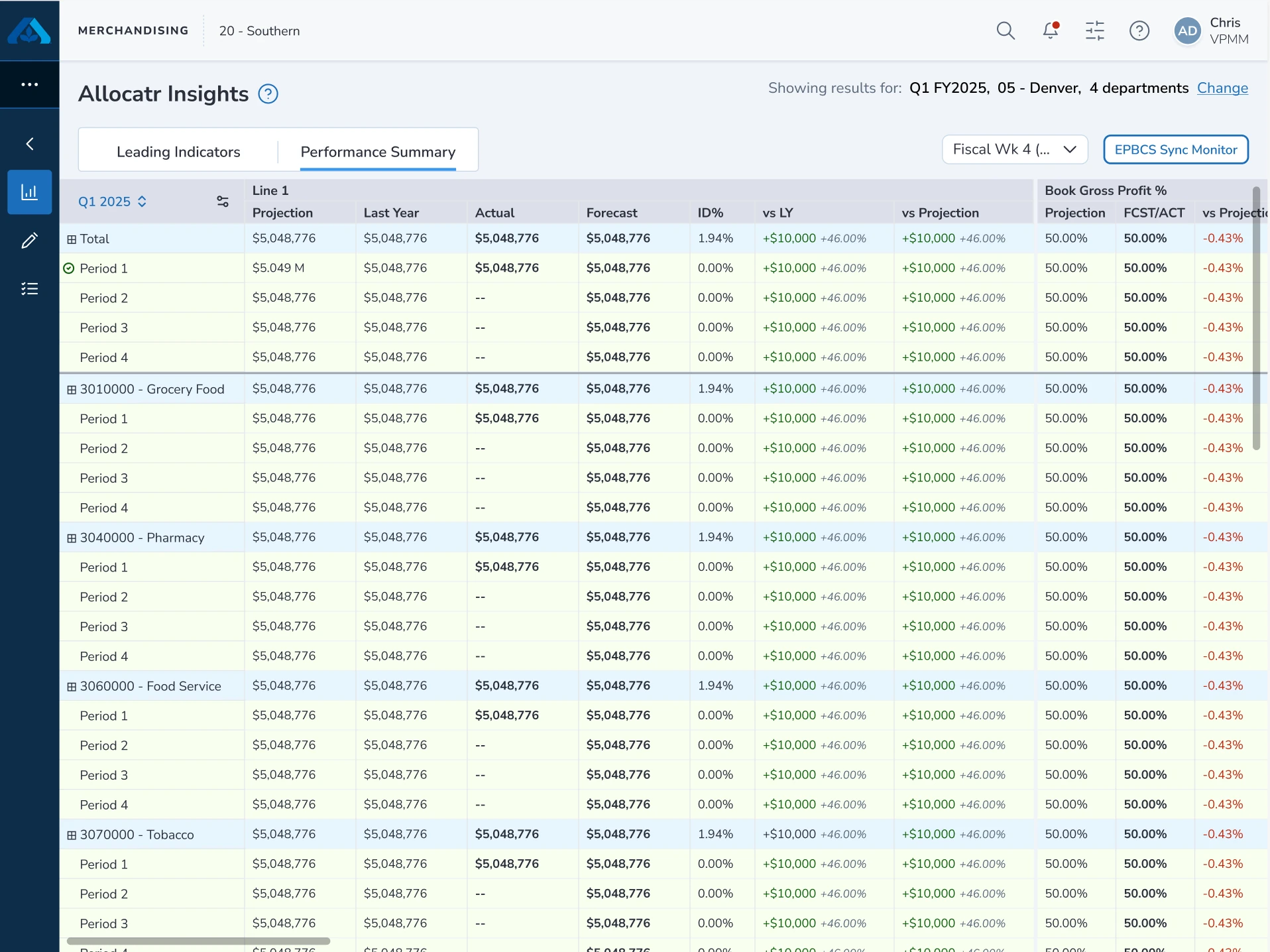
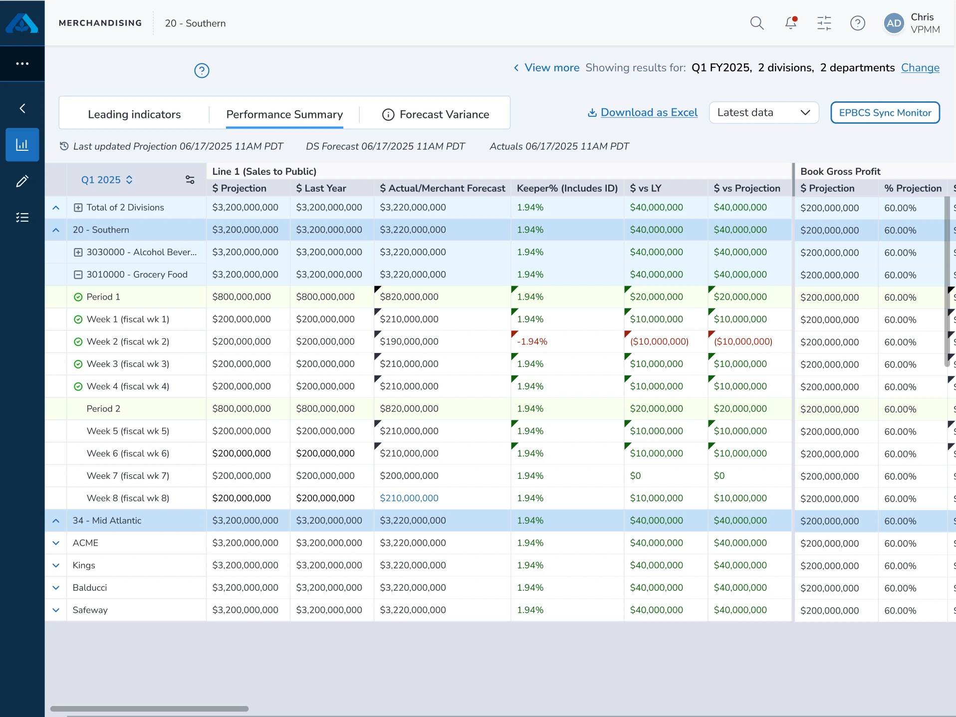
In parallel, I built a read-only dashboard with Quarter-to-Desk drill-downs, timestamps, and custom filters for individual stakeholders.
Initial state
Color coding - blue totals and light-green period data created a clear visual hierarchy that passed user testing.
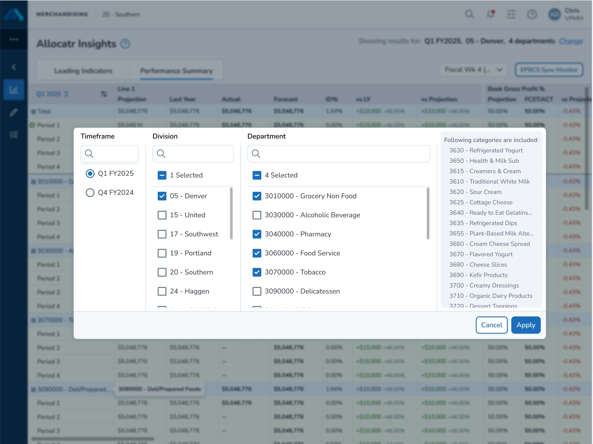
Final state
Cascading rows and complementary colors enabled weekly drill-downs across complex data segments.
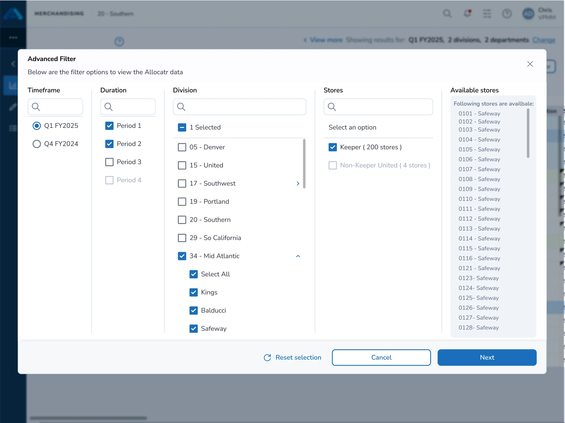
Action bar
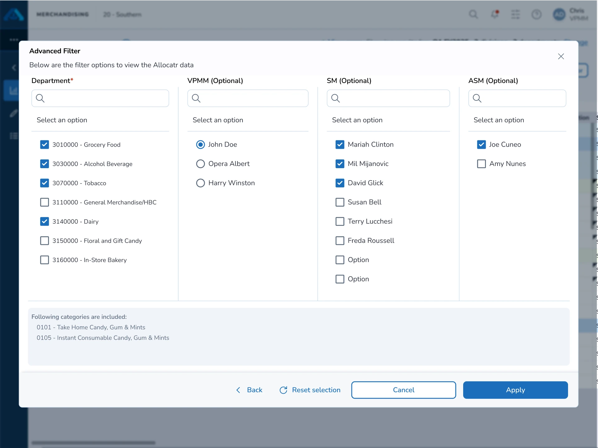
I moved utility tools into a sidebar action bar, cutting main-frame clutter and boosting visual focus.
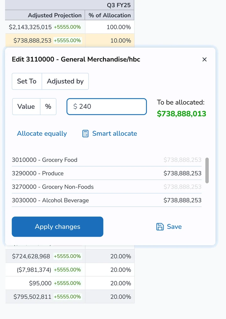
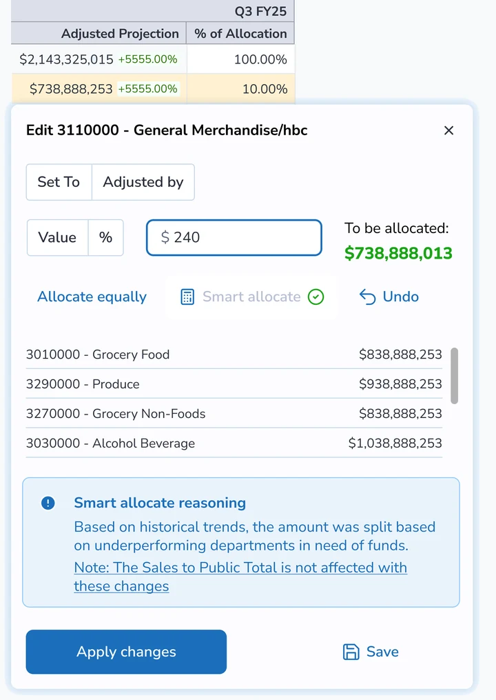
AI-assisted aggregator
I positioned AI as a suggestion layer rather than full automation, prioritizing user trust over quick ROI.
Impact
75% adoption rate in Q3 2025
A top priority for Albertsons’ finance team in FY25–26, the rollout gained swift traction across 600+ merchants and analysts.
38% of changes tracked, Q3 25
Capturing budget changes with clear rationales gave teams far greater accountability during financial planning meetings.
Reflection
Prototypes are tools for objective alignment
Using rapid prototyping allowed me to reveal and mitigate user bias across various use cases, anchoring difficult conversations to drive objective decision-making.
Adopting new technology requires patient change management
Introducing AI meant pairing design with user education. I had to guide users carefully through these unfamiliar benefits, which reinforced that successful change management requires time.