Sam's Club - Walmart · Shipped 2024
Cutting a pharmacy delivery order from 15 minutes to 7
157min
Average associate checkout time per delivery order
40%
Of fulfillment tasks automated

- Service Design
- Enterprise UX
- Design Systems
- Usability Testing
- Cross-functional Collaboration
Overview
Half a million Sam's Club members rely on prescription delivery, but fulfilling these orders forced pharmacy associates to juggle multiple disjointed systems - Connexus, a third-party scheduler, and the POS - often with a customer waiting on the phone.
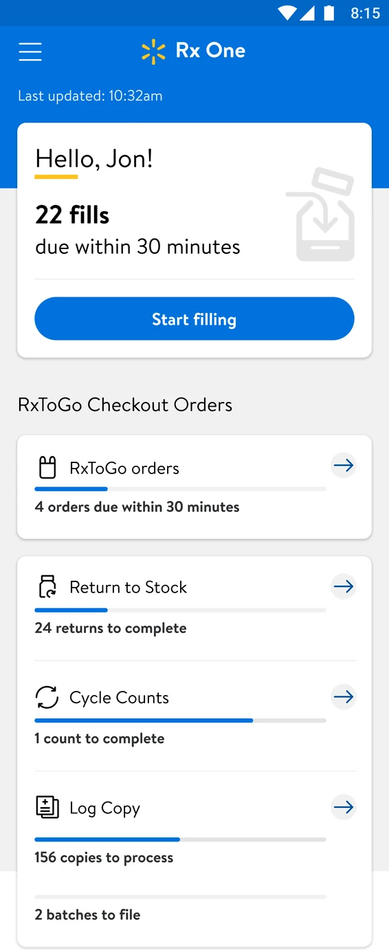
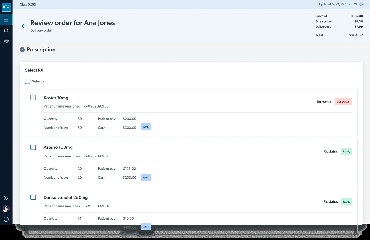
To solve this, I designed RxToGo, a consolidated web portal and companion mobile app that allows associates to seamlessly receive, validate, bag, and dispatch orders. As the sole product designer from discovery to launch, I drove the end-to-end UX strategy in close collaboration with engineering, product, business, and operations teams.
The problem
Fulfilling a delivery order meant navigating three separate systems and physically pacing across half the pharmacy. Associates had to cross-reference dense patient data in Connexus (where accuracy is non-negotiable), process payments in POS, and schedule drivers in GoLocal - all while managing a desk, scanner, printer, and phone.
Associates described the process as tedious, and said it delayed the customers standing at the storefront.
The in-store fulfillment journey
Through my research, I mapped the current-state journey for a Sam's Club pharmacy technician, from creating the order to dropping the envelope in the pickup bin.
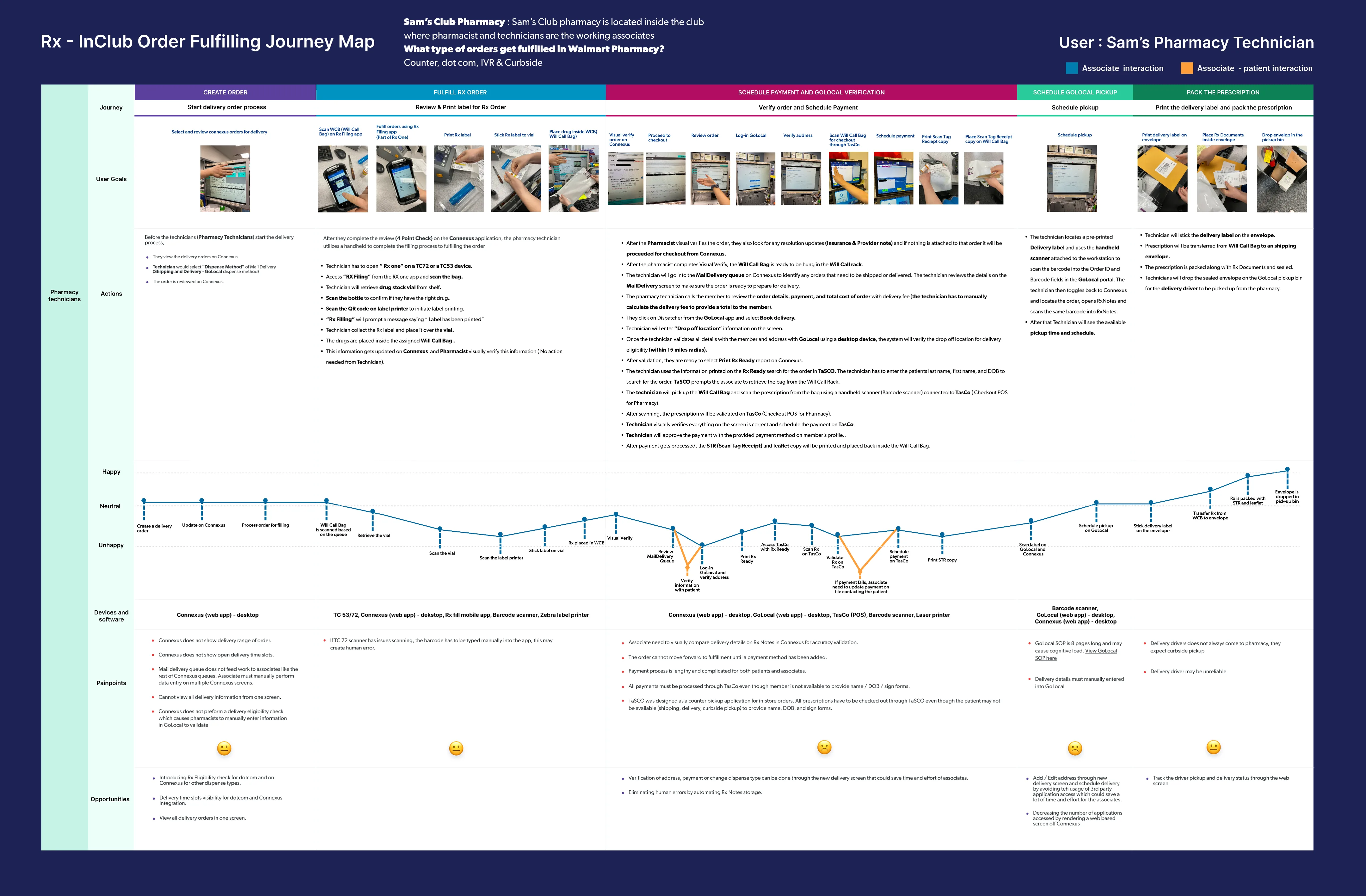
Drag around to move, zoom, or expand it to view in full screen.
My research observations
Connexus spread critical prescription details across multiple screens, requiring a heavy, high-stakes audit before any action could be taken. On high-stakes medical data where mistakes are unacceptable, this scattered layout dramatically increased cognitive load and processing time.
Associates were forced into constant context switching across Connexus, the POS, and GoLocal. Performing this multi-system shuffle while holding a customer on the phone created severe cognitive overload and slowed fulfillment.
After taking payment, associates had to jump to GoLocal to manually re-enter and schedule a delivery time. Running scheduling entirely separate from checkout added friction and duplicated effort.
Completing an order meant jumping to a new screen at every phase: starting, labeling, paying, scheduling, and packing.
Associates constantly shuffled between desk and staging, managing fragmented printers, scanners, phones, and PCs.
The constraint
With fixed legacy tools and POS hardware owned by another team, I designed around these tech constraints to cut unnecessary system touchpoints.
Connexus: the legacy platform
Connexus displayed every order; the red CTA in the top-right corner is the entry point for the delivery order flow.
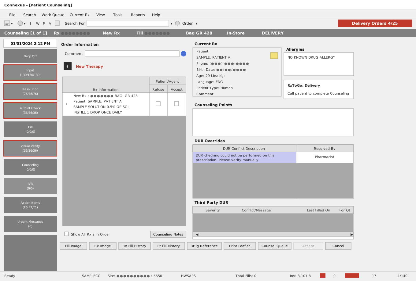
I recreated Connexus for representation purposes; it does not contain any sensitive information.
The engineering team couldn't modify Connexus, but severe fulfillment friction based on research drove team alignment on my strategy of reducing system touchpoints.
Exploration
I originally proposed a new scanning app concept aligned with Sam's Club's suite of products, but we pivoted to adapting an existing Walmart fulfillment app for the following reasons:
- A new Sam's Club native app would cost build time and effort.
- A new UI meant relearning for associates, so the Walmart app flow offered more affordance.
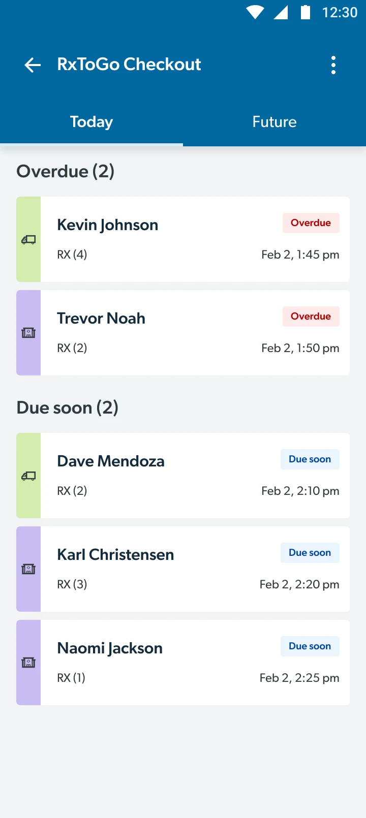
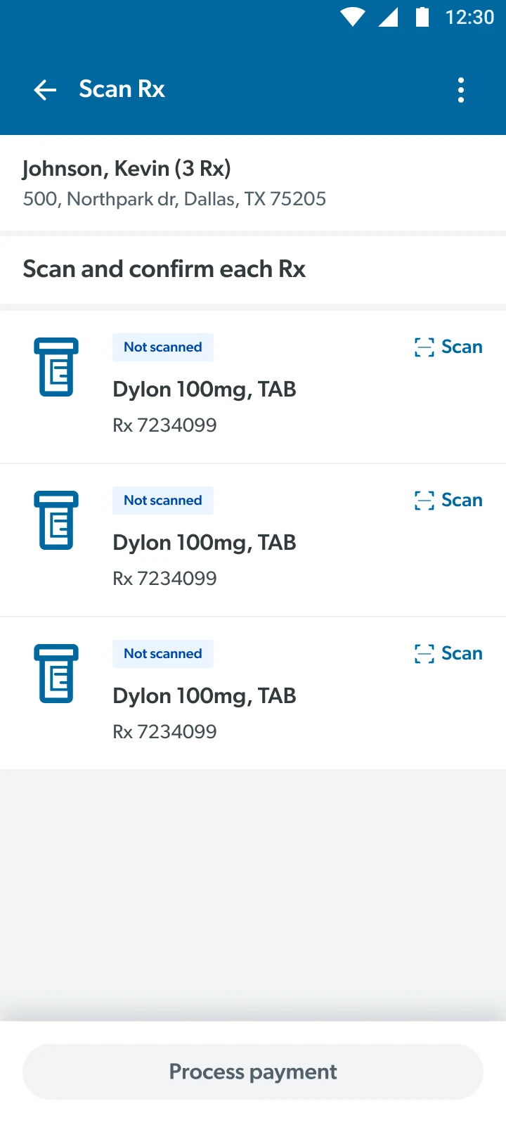
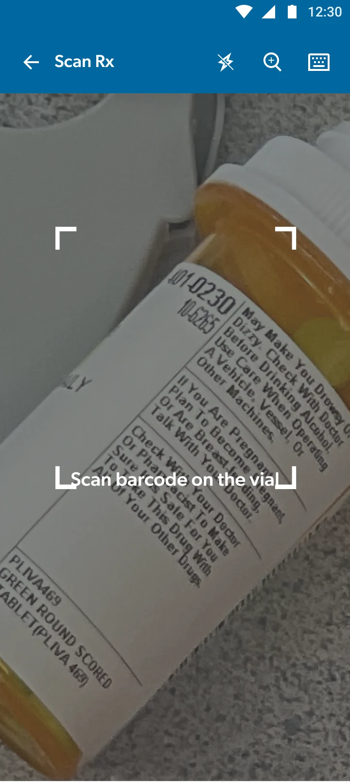
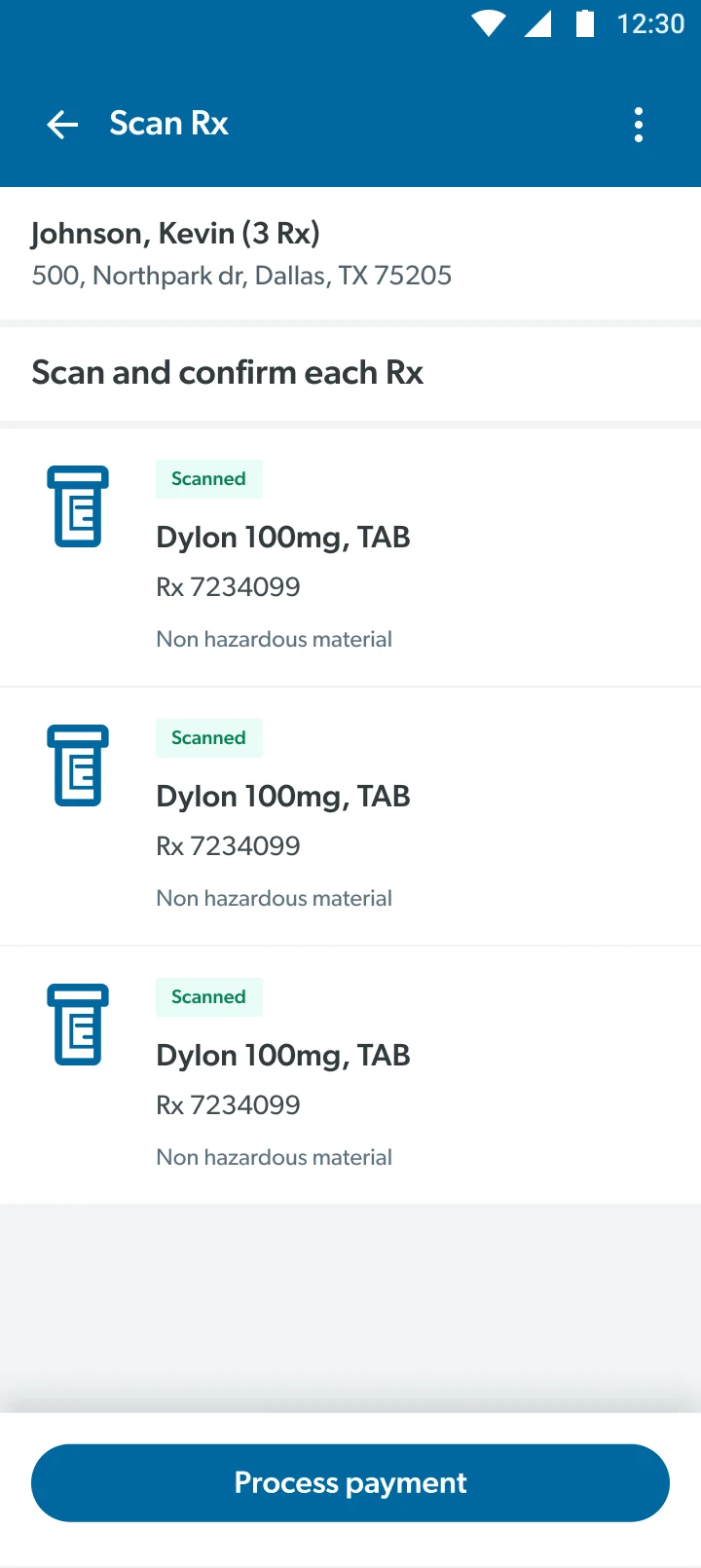
Checkout app with Sam's Club DLS
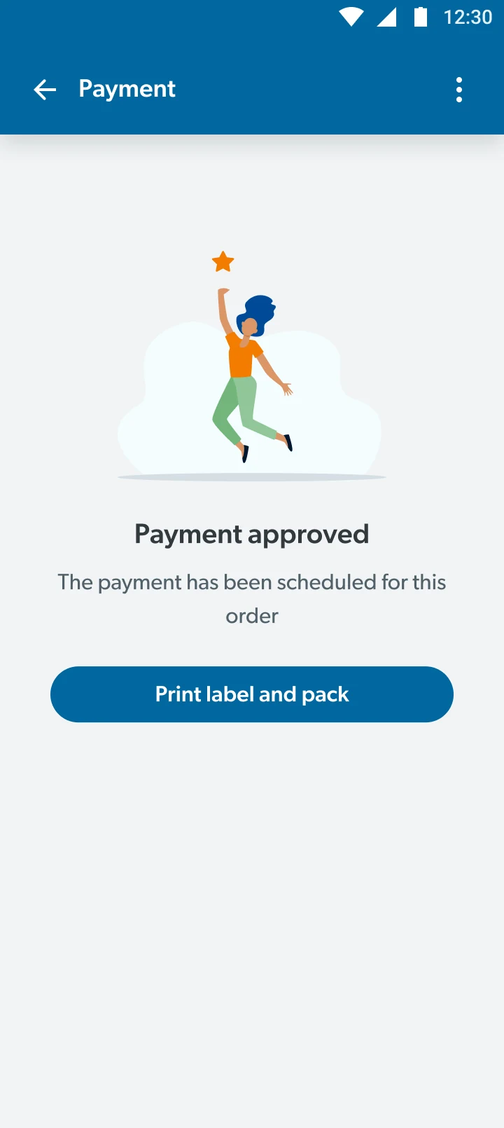
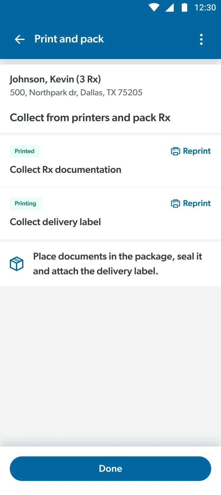
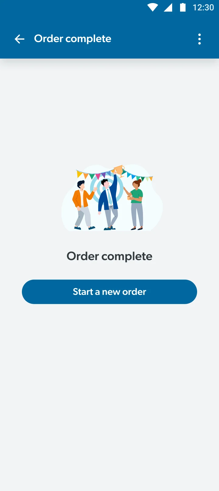
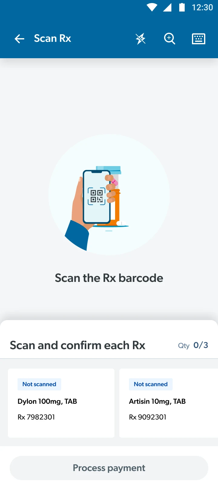
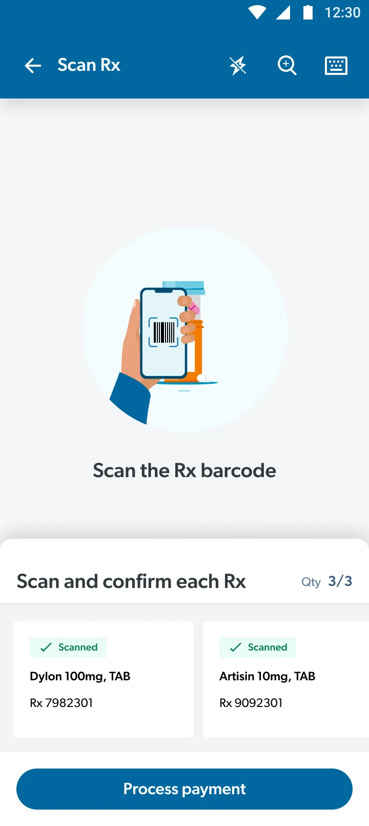
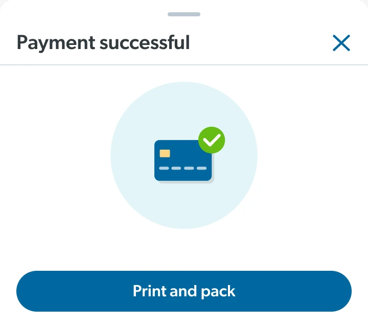
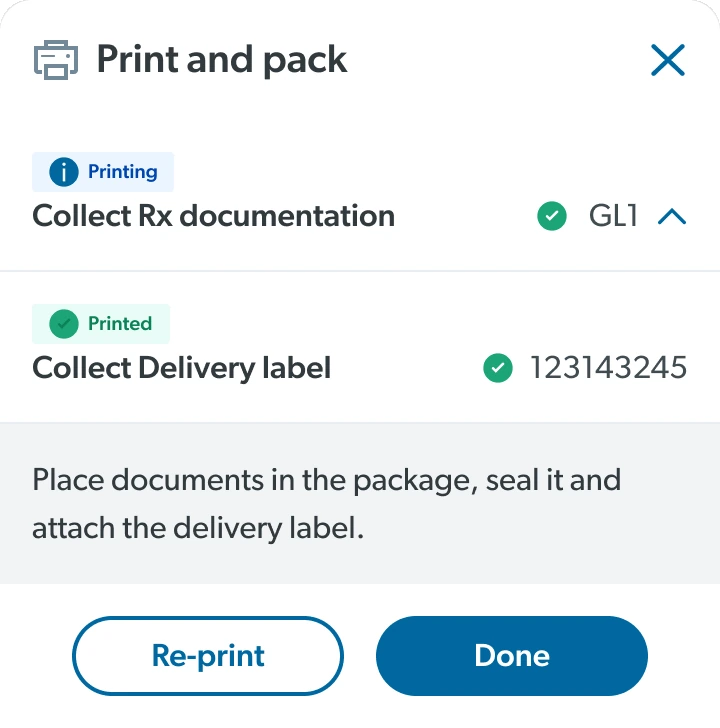
I simplified prescription lists, payment, and printing into a streamlined, minimal checkout flow.
I reused proven Sam's Club UI patterns - carousels and bottom sheets - to make scanning and payment effortless.
The solution
I used one design language across two surfaces: a web portal for managing orders and a mobile app for floor checkout.
Connecting the experience
From my initial observations, I made sure the web portal had a clear information architecture, and the steps that used to span Connexus, POS and GoLocal collapsed into one linear flow.
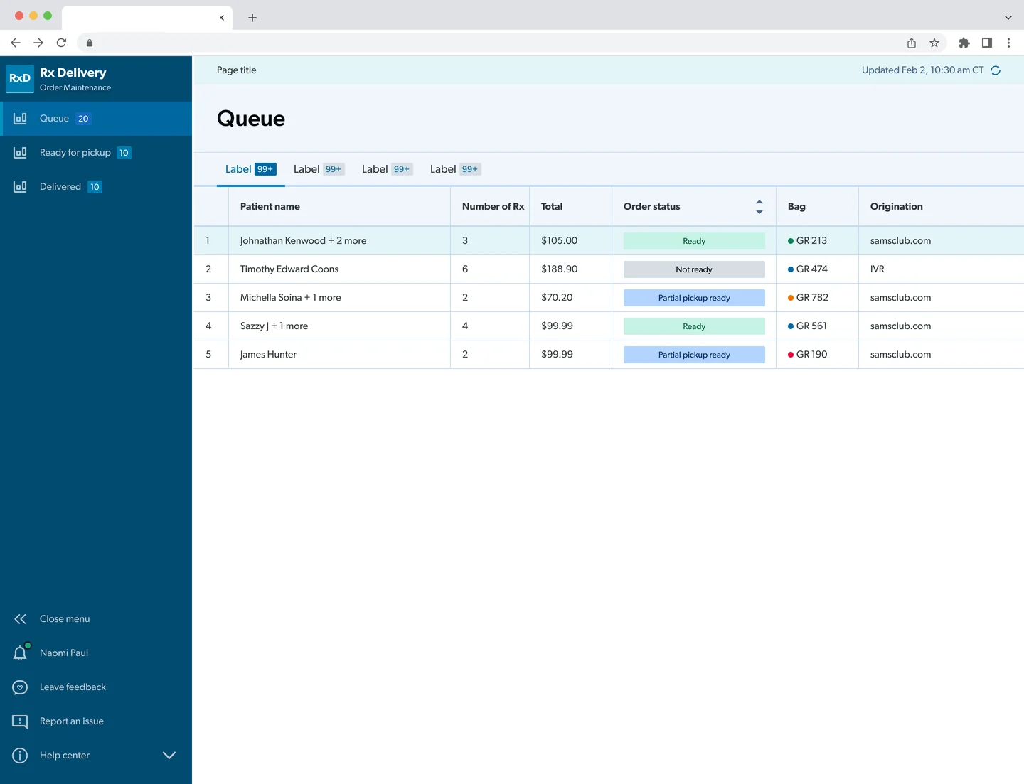


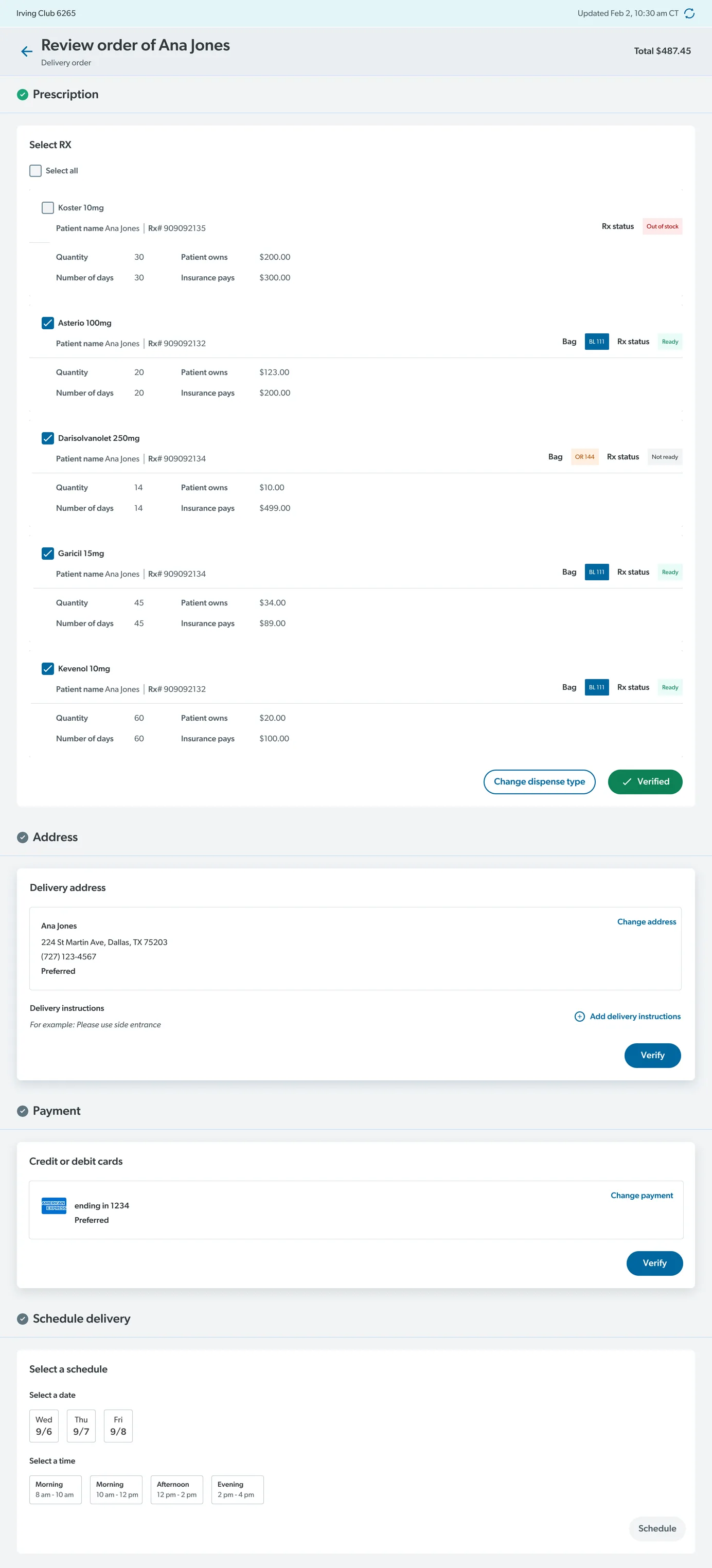
Order Maintenance - Web portal
Prescription list exploration
Iterations made from BlueSteel to Walmart pattern, focused on cards with prescription, patient, and fulfillment metadata.
-
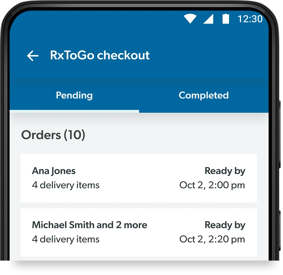 Iteration 1
-
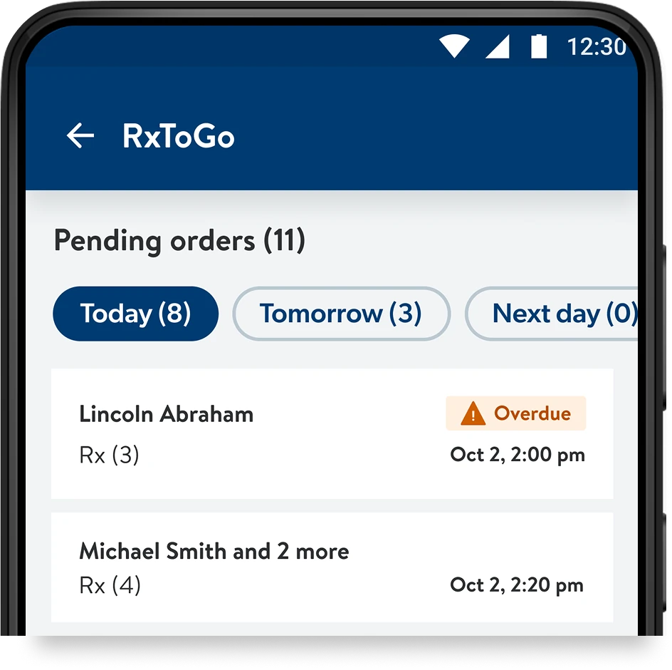 Iteration 2
-
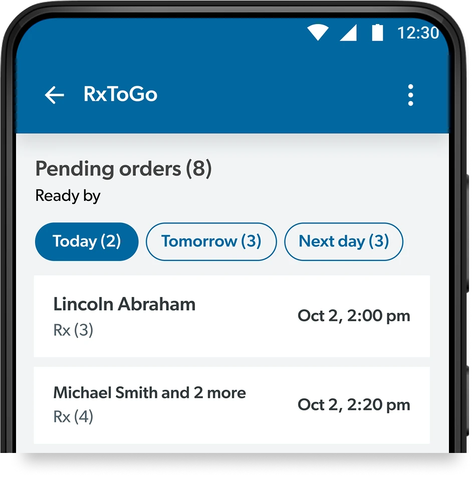 Iteration 3
-
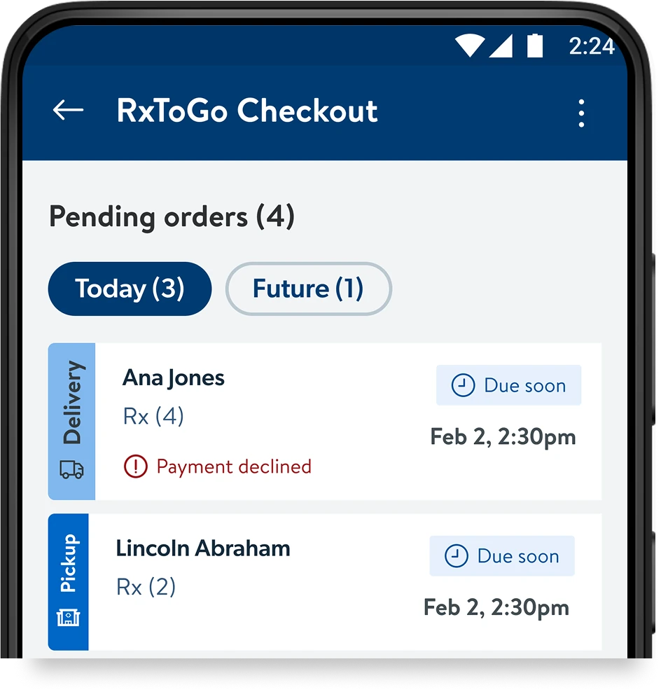 Iteration 4
-
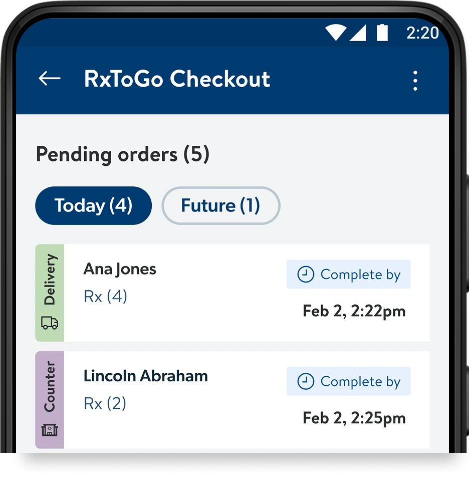 Final design
Scanning interaction
Based on heuristic evaluation, the scanning behavior was changed to guide users with prompt scanning message and also accessible colors with right icon indicators.
-
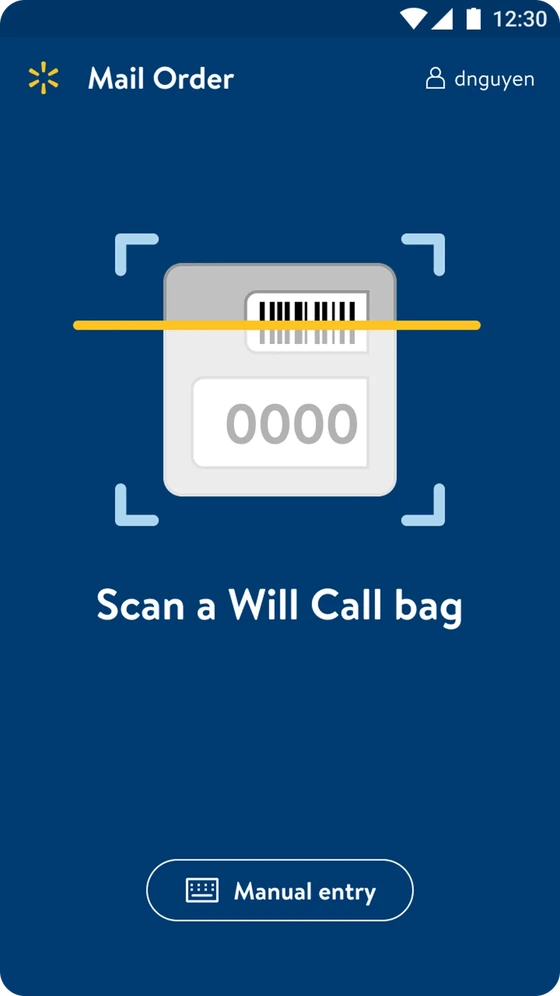 Before
-
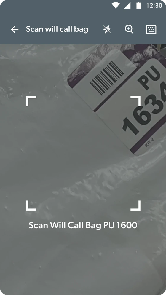 After
After
-
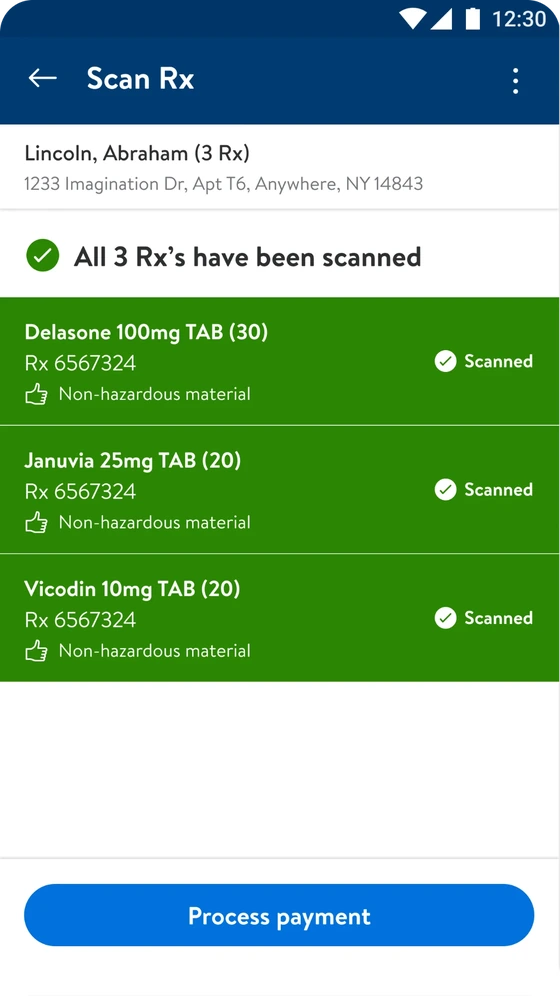 Before
-
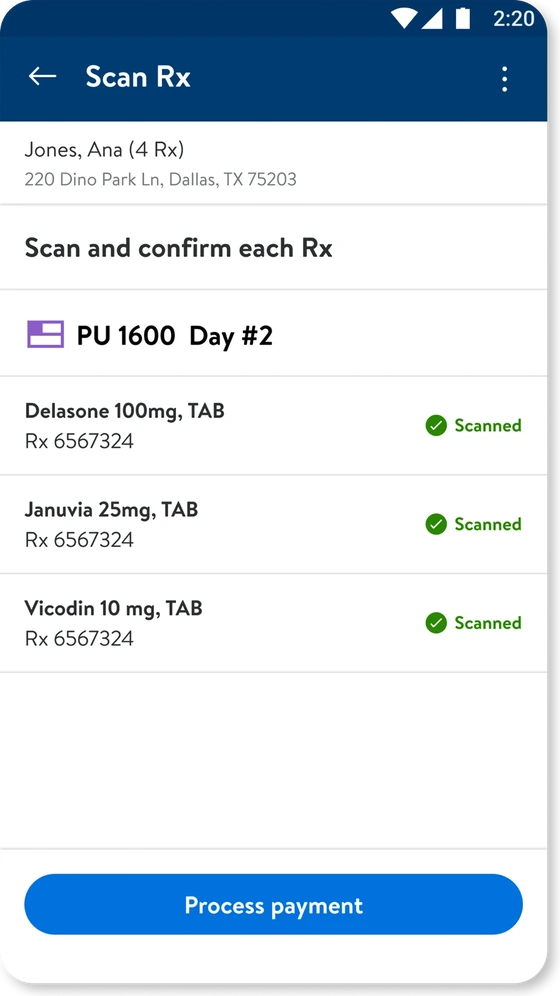 After
After
Shipped flows
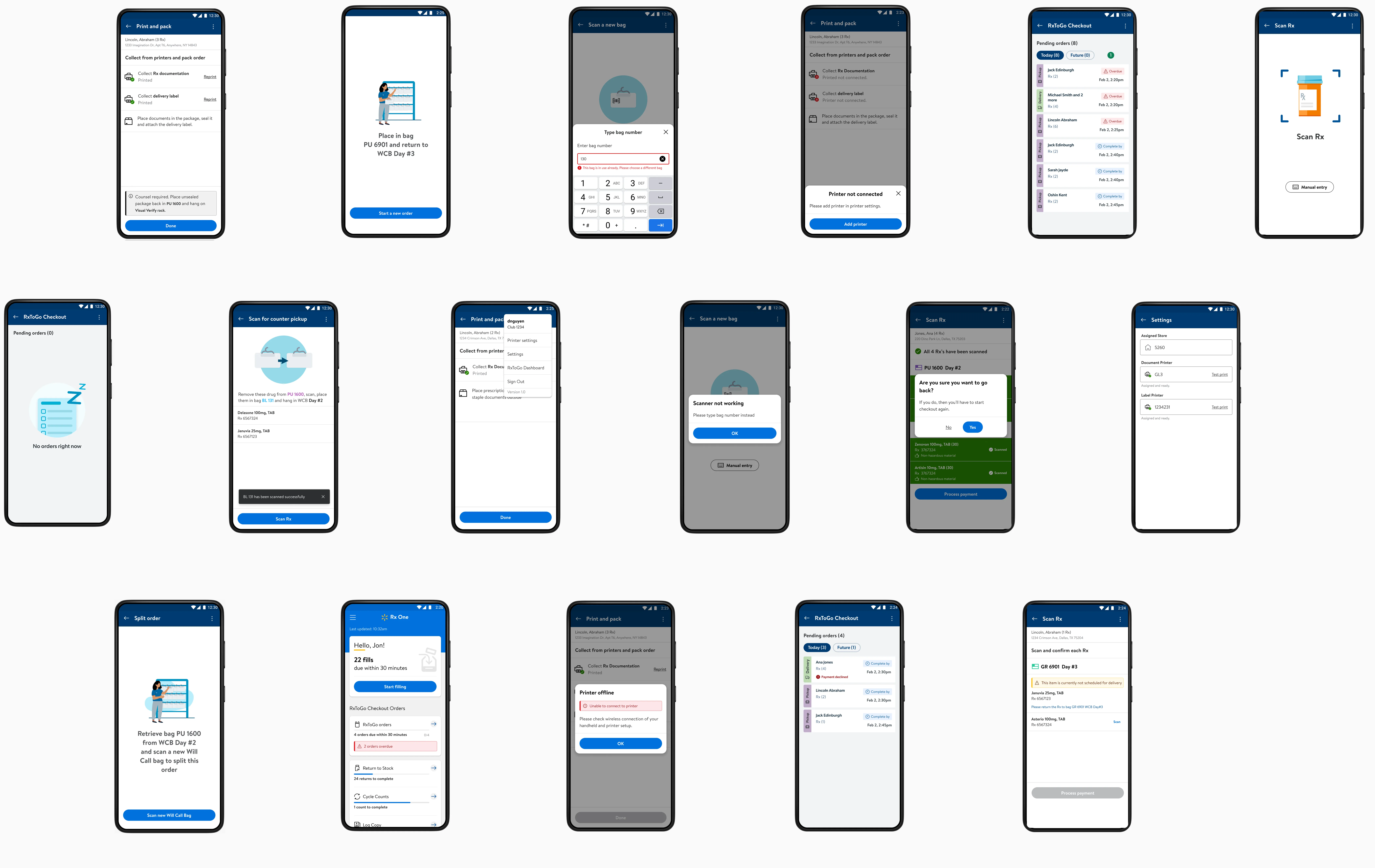
Move cursor around image to view more screens
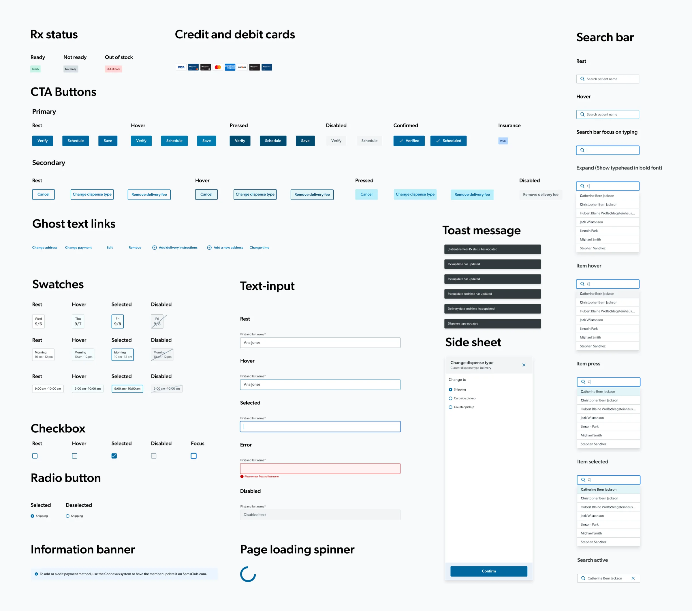
A reusable design system
I built the design system for RxToGo from scratch; the portal’s tokenized UI was launched in BlueSteel DLS, which was used for future internal web tools.
Impact
The order management and mobile checkout were shown at the Health & Wellness quarterly product event.
800+
Delivery orders fulfilled through RxToGo
6
Pilot states at launch
In pre-pilot tests (n=8), I found that associates favored the portal to cut clicks and GoLocal friction, and used the mobile checkout app on the floor seamlessly.
Reflection
Constraints can drive new business opportunities
I respected the engineering pushback and used it as a foundation to develop new ideas. Embracing this limitation allowed my work to branch into different business opportunities in order fulfillment while saving engineering costs.
Looking back reveals opportunities for a unified experience
If I were to rethink the delivered product today, I see the value in a more holistic approach. I would like to combine the grocery + pet pharmacy order fulfillment experiences to create a more seamless journey.