Albertsons Merchandising · Shipped 2025
Rebuilt the image asset collection that vendors kept skipping
92%
Vendor motivation to finish the image step
+20%
Increase in engagement after launch
2
Teams served by one repository

- Enterprise UX
- Interaction Design
- Design Systems
- AI-Assisted Prototyping
Overview
The merchandising item team briefed me about a feature vendors had abandoned, creating a break in the user experience. During item onboarding, the image asset collection supports the merchandising team, since every product at Albertsons requires images and data from vendors.
I designed the MVP scope of this flow, which served as the item onboarding channel for capturing item images. This experience improved engagement and benefited two different teams through a cost efficient design approach.
Outcomes
Beyond the final engagement outcome numbers, the split-card and scalable-table pattern that I designed became a reference for other merchant pods during the item onboarding redesign project, and the shared backend repository gateway removed a recurring source of vendor-to-marketing friction.
Problem space
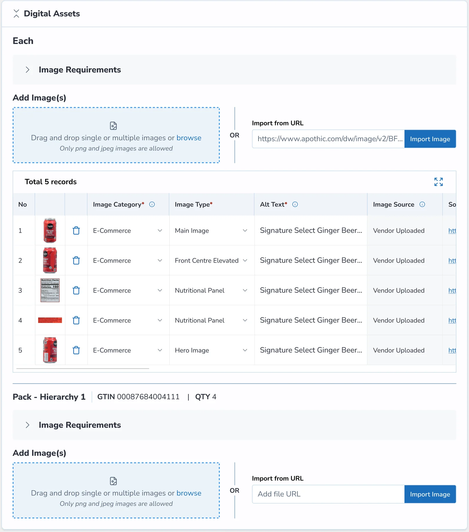
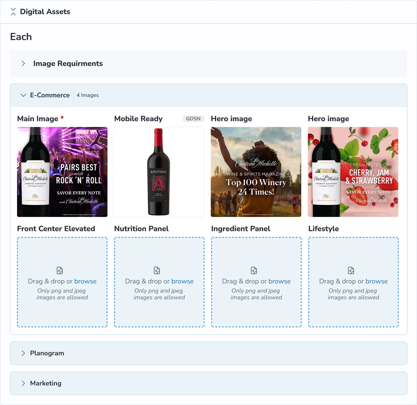
I observed that one card per image across four packing levels of an item (Each, Pack, Case, Pallet) caused endless scrolling and cluttered metadata that led vendors to abandon it. Vendors were sharing data offline with merchants, bypassing this step.
As a result, the merchandising team couldn't collect item images, with vendor motivation as low as 10%.
More images meant more scrolling... Metadata on one card made content type unclear

Project constraints
This was two months into the 11-month long item onboarding redesign project, so the redesign had to fit into ongoing sprints.
Emerging opportunity
Through vendor conversations, I discovered that vendors shared the same data with the Marketing team. This prompted me to build a dual-purpose model serving Merchandising and Marketing within supply chain rules.
Despite high dev effort, I successfully advocated for an image ETL pipeline to prioritize long-term UX and efficiency by placing user experience above technical effort.
The solution
I followed three principles on this redesign: scalability across channels, glanceability through a modular pattern, and progressive reduction, by breaking one heavy component into smaller pieces.
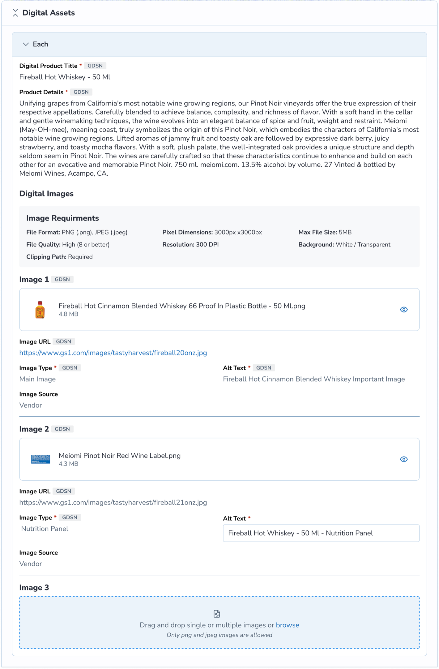
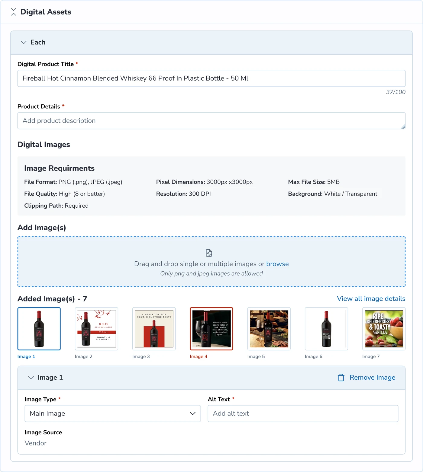
My first iteration focused on reducing scroll with a compact carousel image capture.
I also split the product detail and image sections in two to reduce visual load.
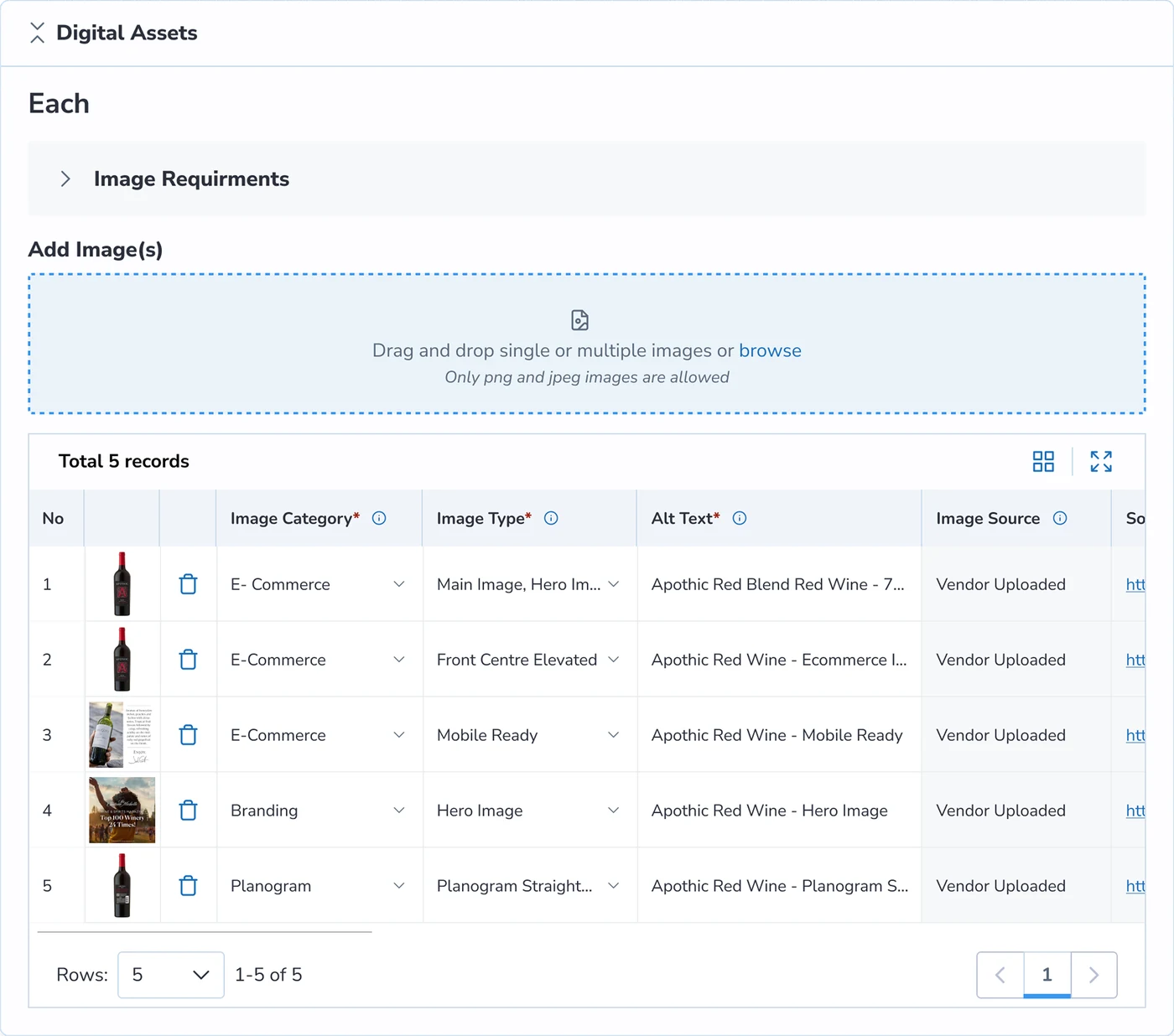
In A/B testing, users liked the split and asked for a linear image capture, which led to the table format.
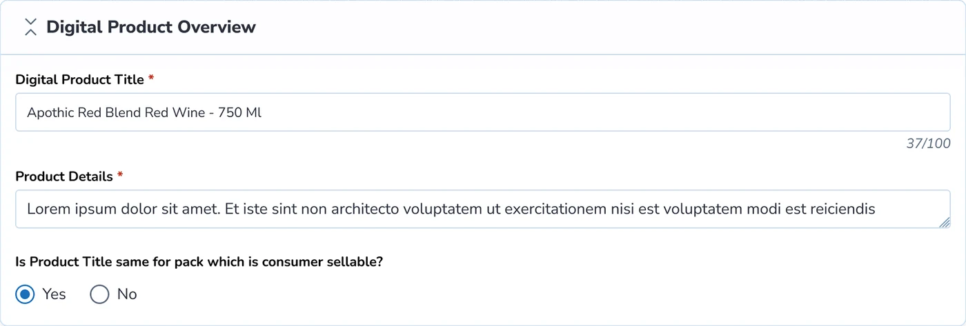
Component Segmentation
Through user testing I found scalable tables helped vendors to categorize assets and record the image types. It also improved visibility and accountability when glancing at large sets of image data.


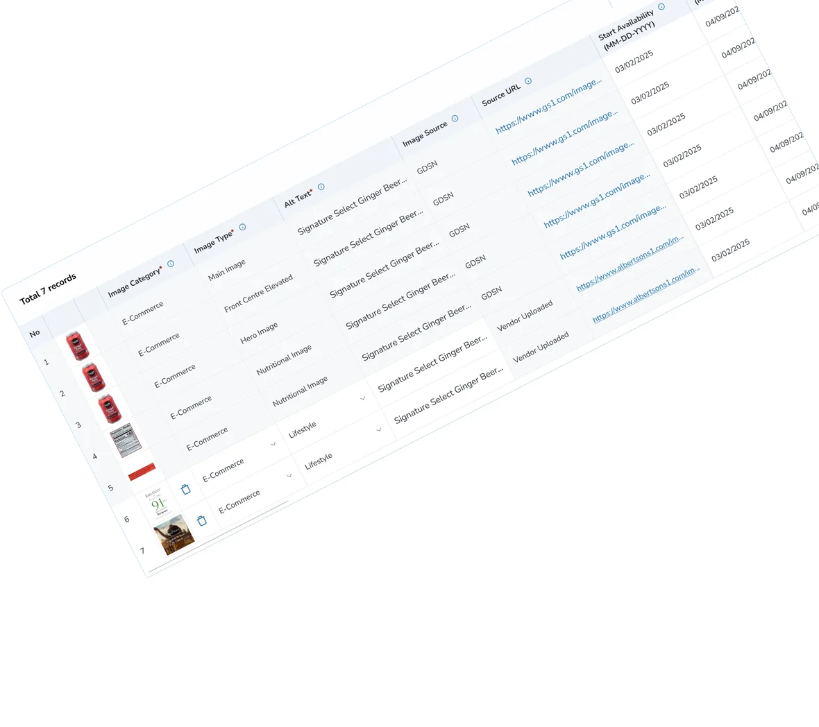
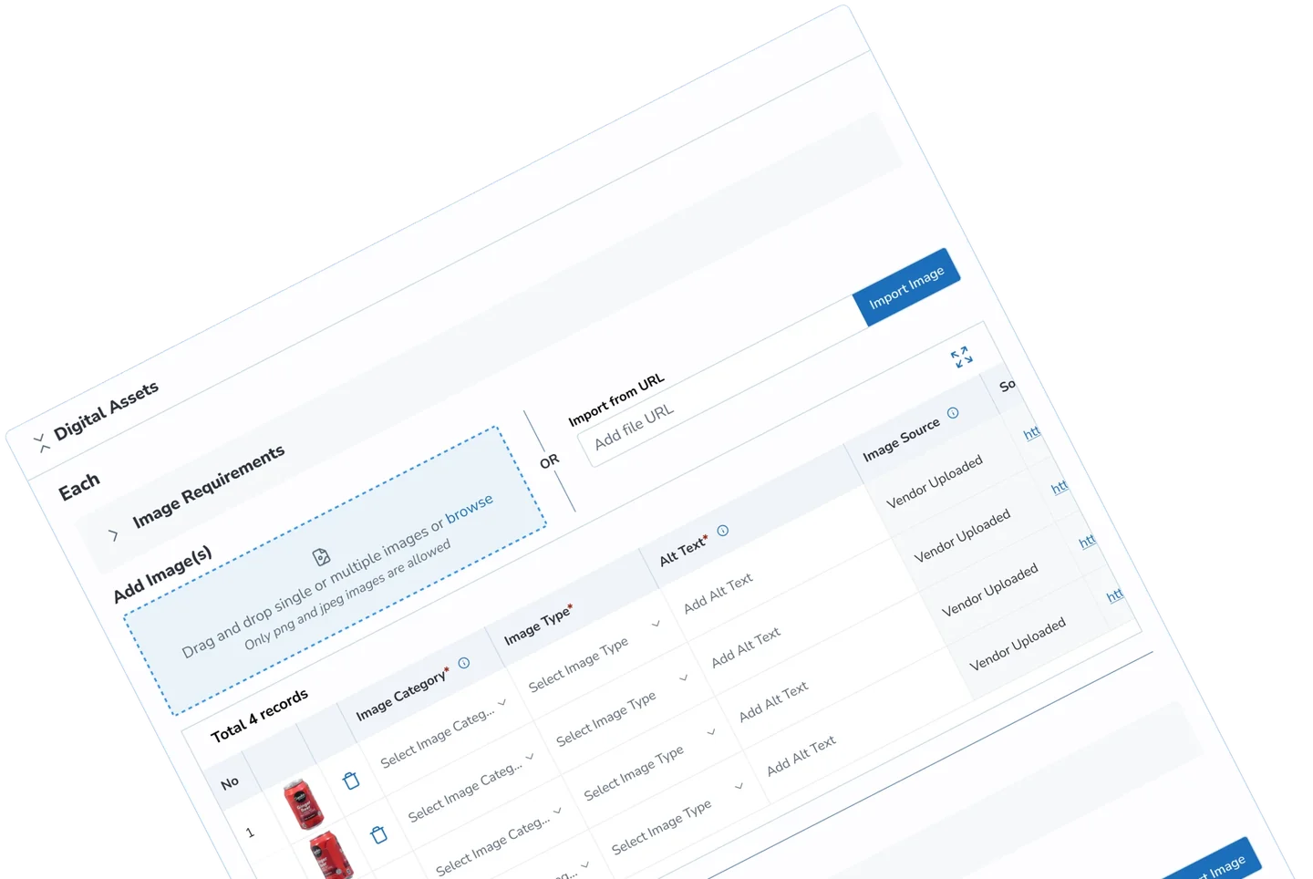
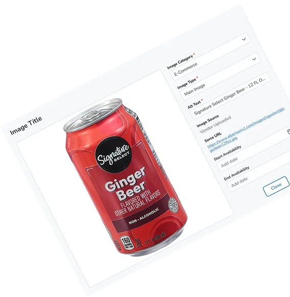
Final design
AI vision
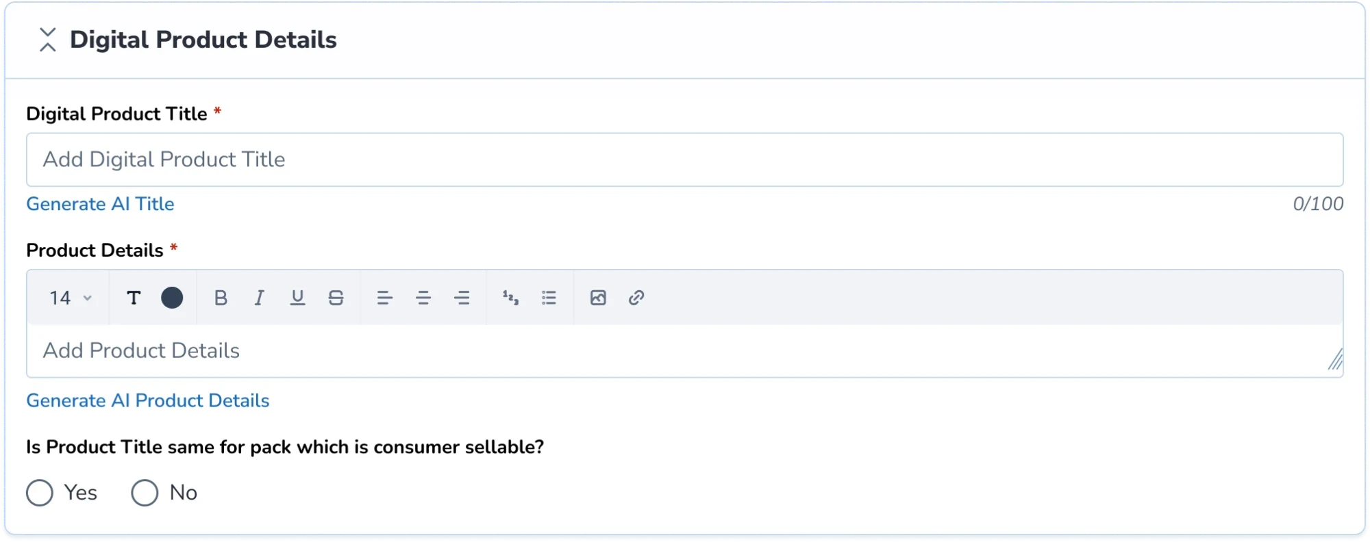
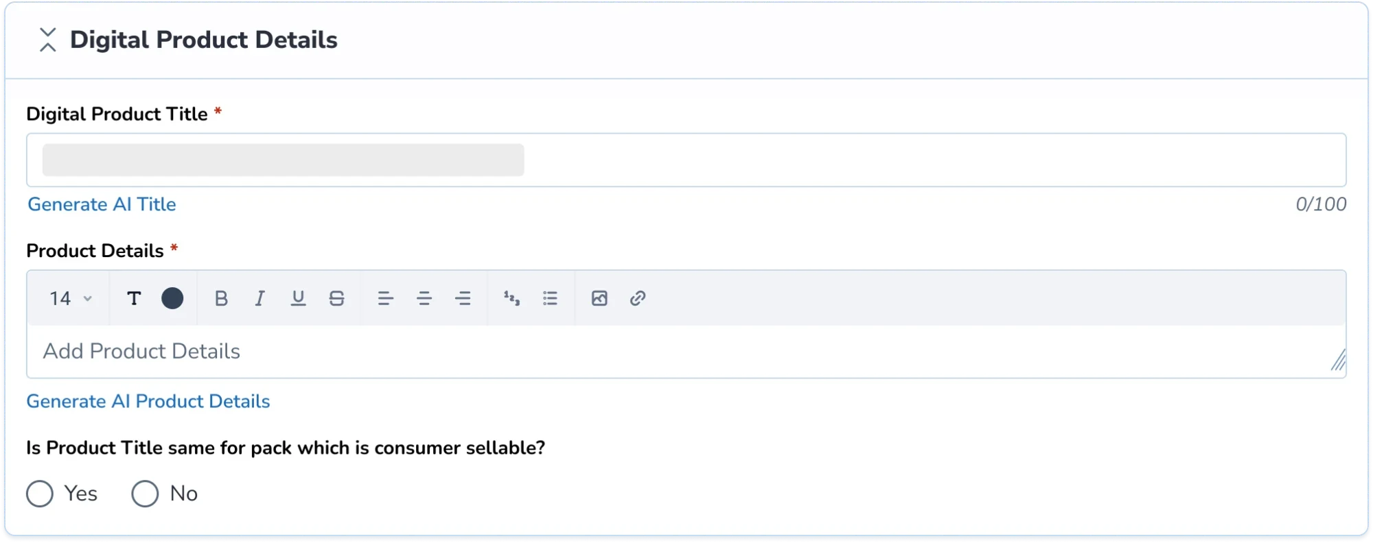
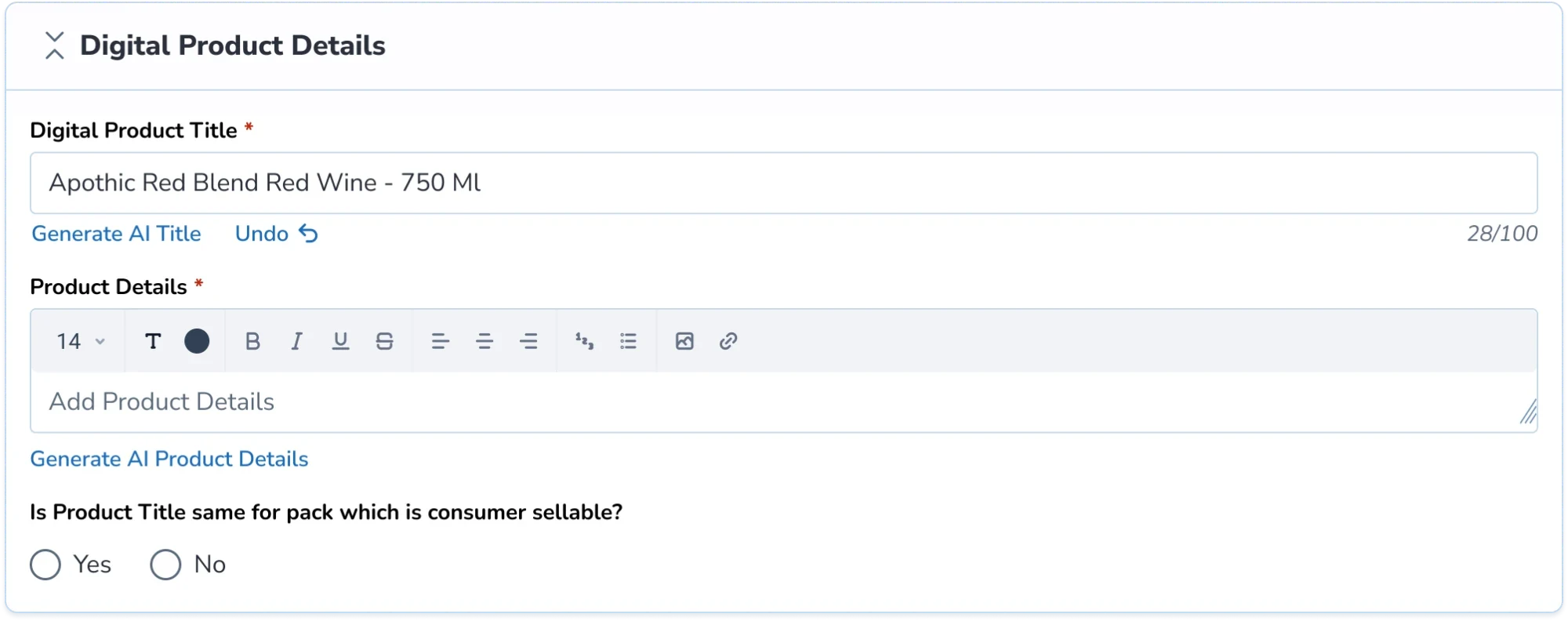
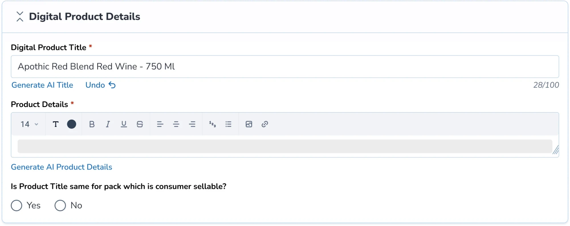
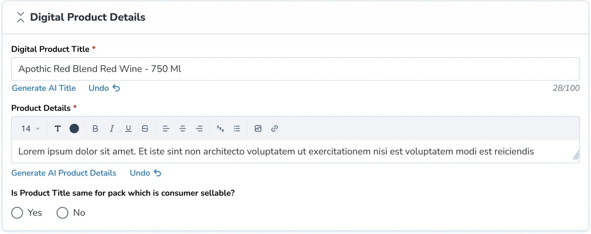
I explored an AI title-and-description generator: a rich-text editor that suggested product copy. Low LLM trust led vendors to reject the AI copy generator, favoring official manufacturer specifications.
AI title & description generator.
Reflection
Product design extends into operational strategy
Multiple cross-functional conversations challenged me to look beyond the immediate product perspective. Finding ways to bridge new operational possibilities ended up being one of my biggest takeaways from this project.
Pushing technical boundaries creates scalable patterns
If I had stretched the team's capabilities to build AI-assisted content generation, the impact would have compounded. It would have created a blueprint for future merchandising tools.